Previous Article
Next Article
- AM WORLD
- FEATURES
DESIGN
MODERN CLASSICS
David Linley introduces a selection of leading creative figures,
who reveal how classic design and invention, allied in many cases to modern technologies, have influenced their work and thinking
Illustrations: Luke Wilson
furniture making is an
ancient art which transcends millennia and although influences, designs and materials frequently evolve as a result of necessity, tastes and technology,
I believe it is safe to say that when it comes to the
art of handcrafting fine pieces, the skills required still stem from furniture makings earliest roots.
A core design goal of mine is to meld established techniques attributed to the tried and tested approach with the latest technological advances, tools and design expertise.
Indeed, our current ranges of furniture demonstrate a clear spectrum of the traditional through to the contemporary, both in terms of their aesthetic and their construction. On the one hand there is the Linley Classic collectionconceived over 25 years ago, grounded in time-honoured practices and heavily inspired by the Renaissance architecture of the 15th to 17th centuries, which placed great emphasis on symmetry, proportion, geometry and the regularity of parts. Juxtapose this with the Graft collection, the result of a collaboration with young British designer Simon Hasan for the London Design Festival; he puts an irreverent spin on marquetry, celebrating the natural imperfections of the timber used in their construction. What you can see is a fresh design eye pushing the boundaries of traditional cabinetmaking with unusual materials, advanced technologies and a unique aesthetic whilst maintaining and championing traditional and long-established techniques representing British craftsmanship at its very best.

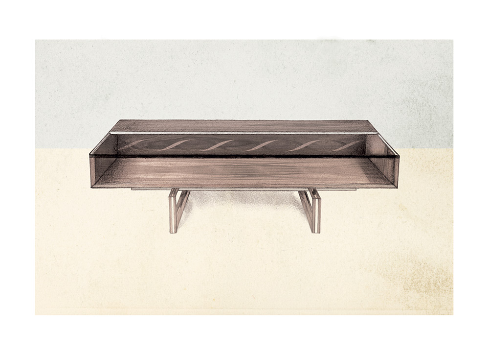
Helix Furniture Range
The Linley Helix range was influenced by mid-century Scandinavian furniture design. Its clean and crisp silhouette pays homage to the Danish chairs I grew up with; my father was particularly fond of Danish furniture design, especially the work of Poul Kjaerholm whose furniture demonstrated an exquisite combination of wood with leather, cane, steel or marble. The new industrial technologies that were used to create these pieces and others like it worked well when combined with ideas of simplicity and functionalism.
With our twist of the marquetry inlay depicting the intertwined twin strands of the double helix, or the unit cell of DNA, this collection demonstrates how marquetry works in a modern idiom. The complexity of its construction stems from the multiple processes required to create the finished effect from the hand-cut dovetail joints and carefully concealed drawers to the laser-cut marquetry inlay and the metal stringing, which is achieved using a machine designed for making pieces for yachts. Its assembly demonstrates the definitive fusion of the old and the new.

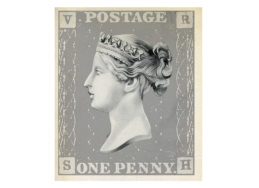
The Penny Black
The Penny Black is graphically very beautiful and
does exactly what it is meant to do, the two prerequisites of great design. There were no real postage stamps before this and so it is, in its way, revolutionary. The United Kingdom has, to this day, the only postage stamps that dont have their countrys name on them. It only has the profile of the monarch.
I love cameos and use this technique a lot. The simplicity of this profile against a black background gives it a jewel-like quality. The face of young Victoria, beautifully engraved, has, in this format, become a great icon. This contemporary-seeming graphic design was being mooted in the 1830s while Dickens was writing Oliver Twist, showing British genius for design and innovation at its most potent.
Anything this perfect, from the London Underground map to a William Morris wallpaper or Eric Gills lettering to a Jacobean engraved and enamelled band, is inspirational and shows how simple lines are the foundation of all great design. On these you can build as uncluttered or theatrical a vision as you like.

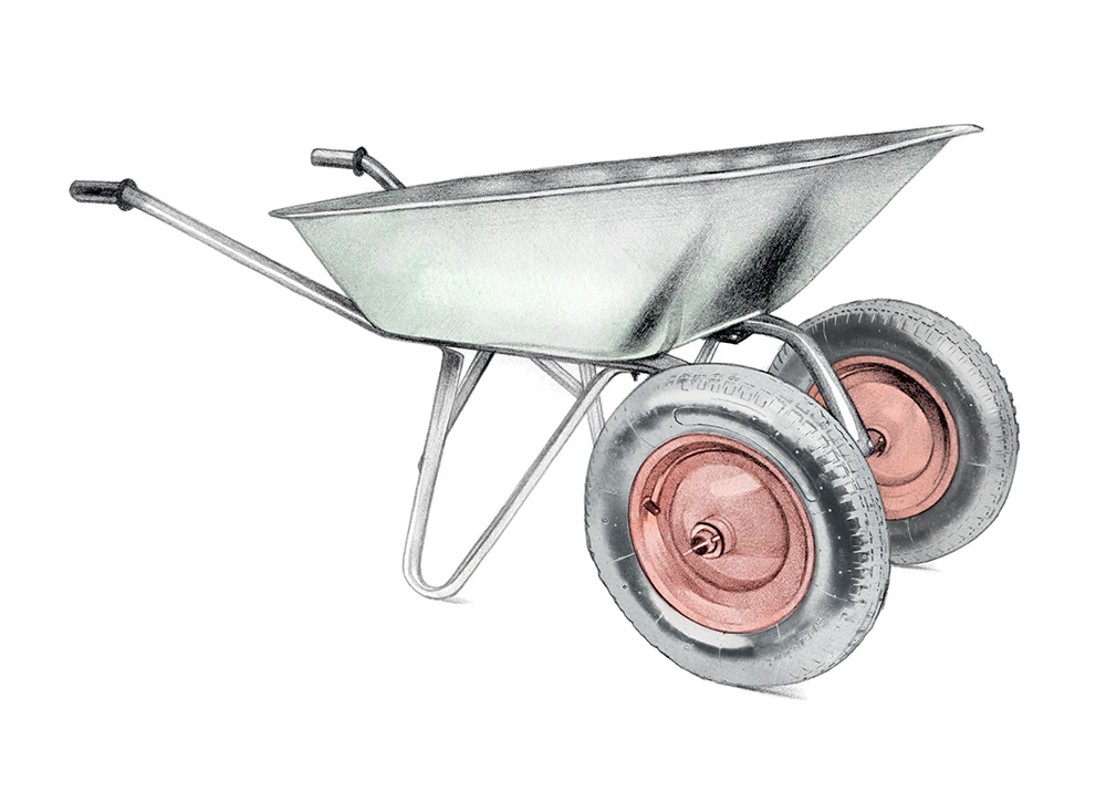
The Wheelbarrow
Who invented the wheelbarrow? Although wheelbarrows in the form of one-wheel carts date back to ancient Greece and China and were used in the medieval period, the design we immediately tend to think of is credited to the Frenchman, Blaise Pascal. A 17th-century thinker, mathematician, scientist, man of letters and a true genius, he was somebody who exemplified the term Renaissance man and influenced his own time and ours as well.
Before the wheelbarrow, stretchers were commonly used to move heavy materials around, but this required at least two men to carry the weight. Pascals wheelbarrow had long, graceful arms for handles with a wheel pitched forward, giving a single operator a centre of gravity and smoother transportation.
Variations include two-wheel designs, four-wheel, cart-like designs, and even designs that include
self-propelling motors. Its such a simple invention but it has made life easier for so many people.

Supermarine Spitfire
The Supermarine Spitfire is that iconic and
lasting reminder of the Battle of Britain during the Second World War. Although I do a lot of interiors work as an architect, I think a lot of things that are born out of the necessity of war show engineering at its best.
The Spitfires speed was its main asset with its shape and form designed so it could be very, very fast. Structurally, it is very important. Inspired by the streamlining of racing trains, it had the first retractable undercarriage while its incredible elliptical wings were modelled on racing planes. The Spitfire was markedly quicker through the air than that other famous Second World War fighter, the Hawker Hurricane.
As a designer, it is structure, form and efficiency which are the things that can influence my work. As an architect, youve got to make it look nice and its got to stand up. There are a huge amount of parallels between designing products and architecture. Buildings arent products but they go through the same processthey have to fit a job that suits their purpose.
Previous Article
Next Article
- AM WORLD
- FEATURES
